Sélone Studio
Identity and Shopify website for a womenswear label built around contrast.
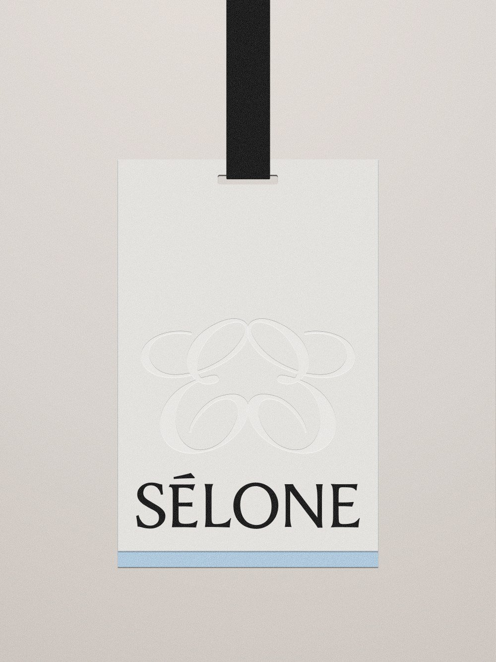
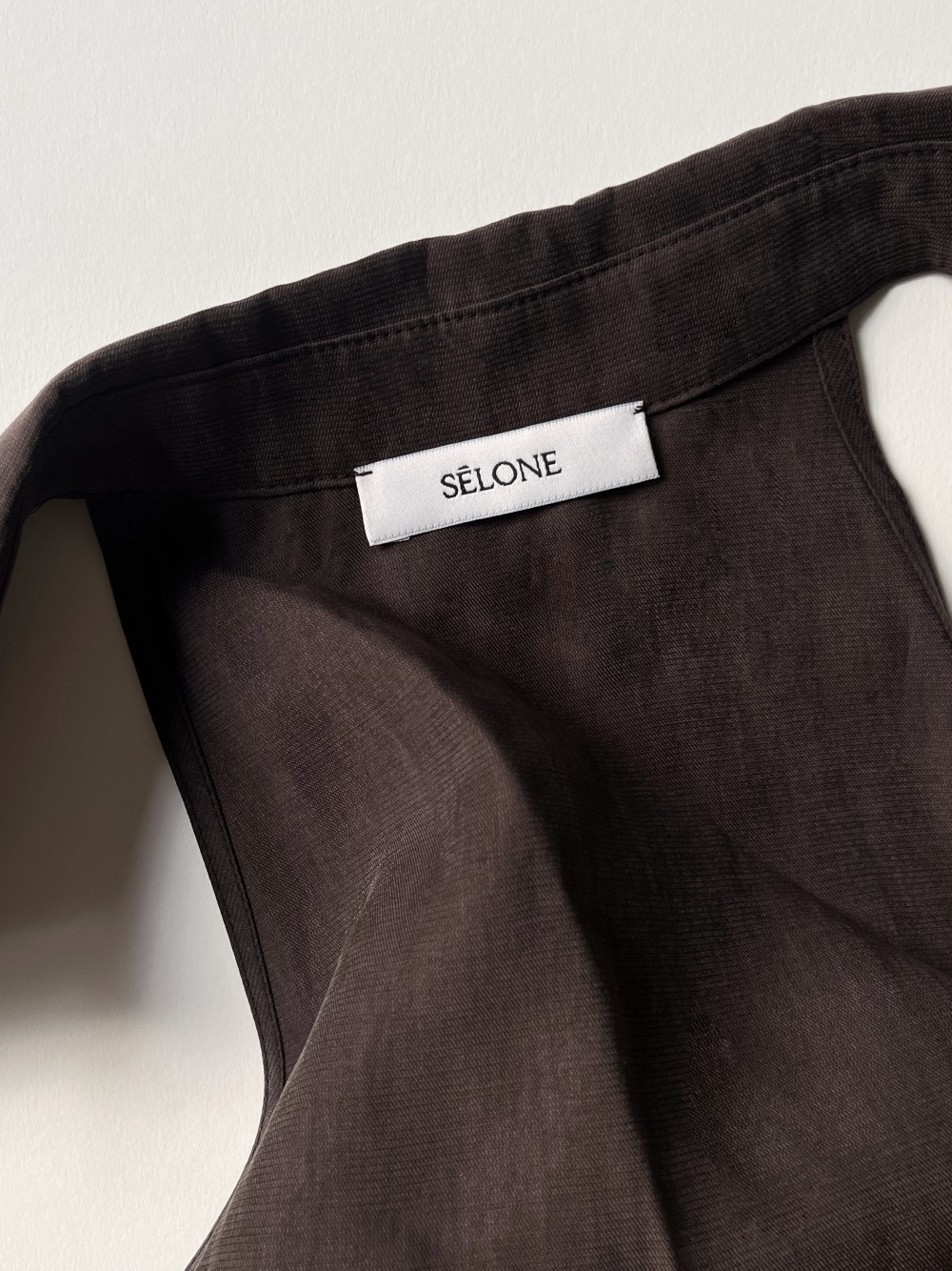
The wordmark is a clean sans with traces of script.
It nods to the label’s UK-Turkish roots. The monogram mirrors two E letterforms, adding free-flowing curves to the identity.
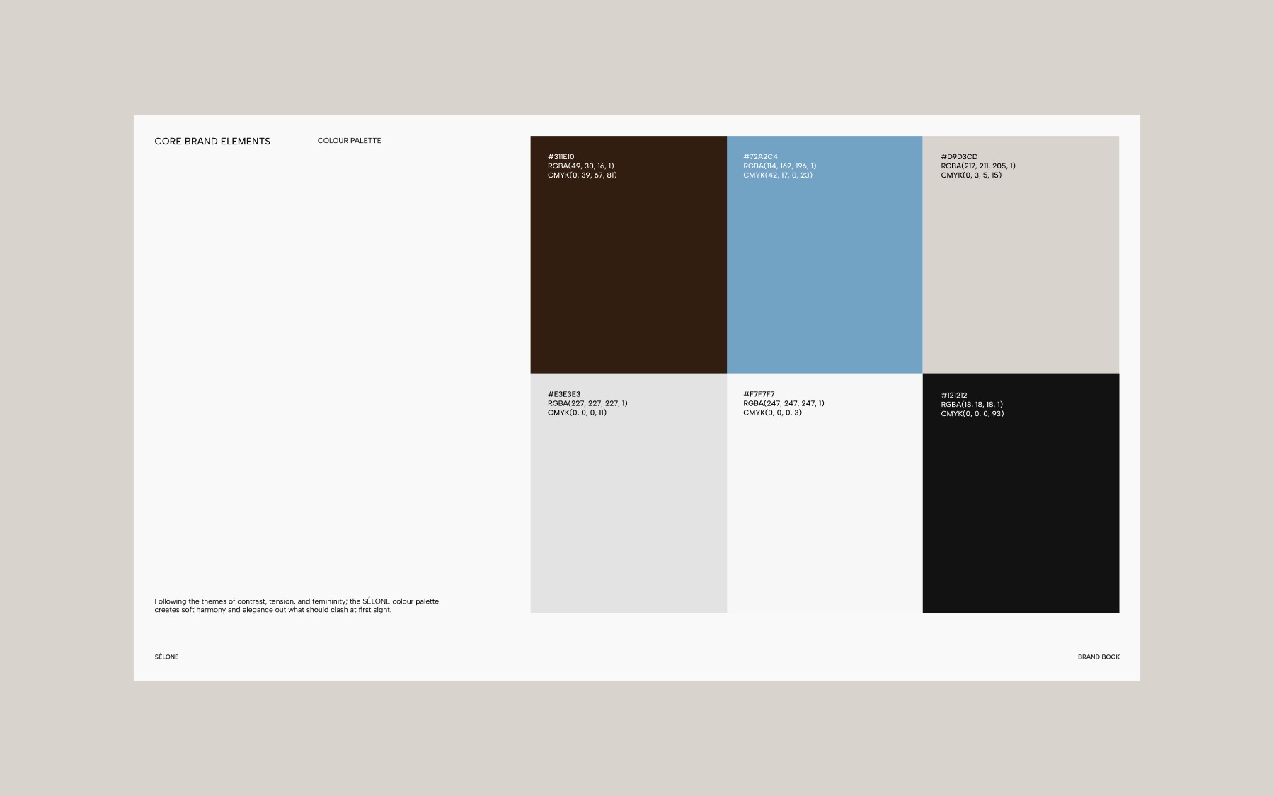
The palette pairs colours that should clash.
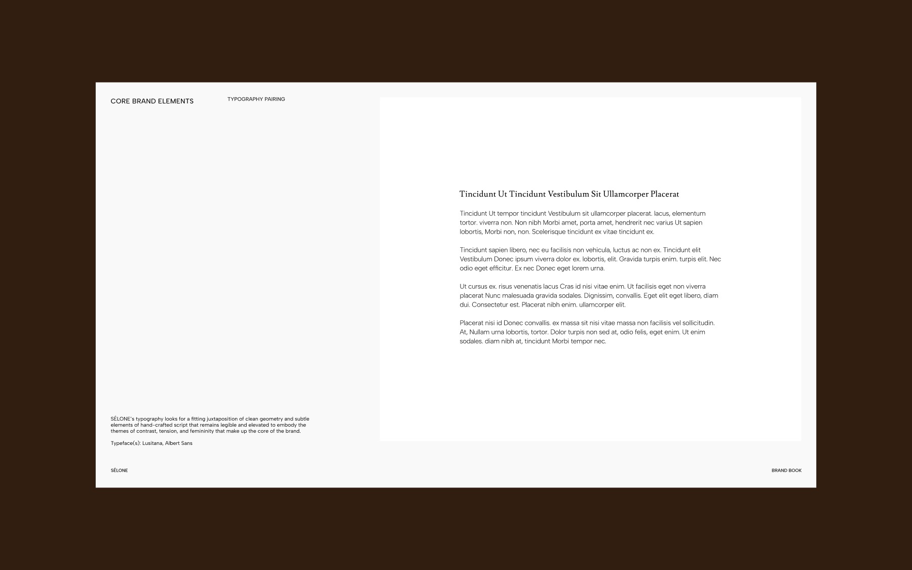
Palette and type follow the label’s themes of contrast, tension and femininity, pairing clean geometry with touches of script.
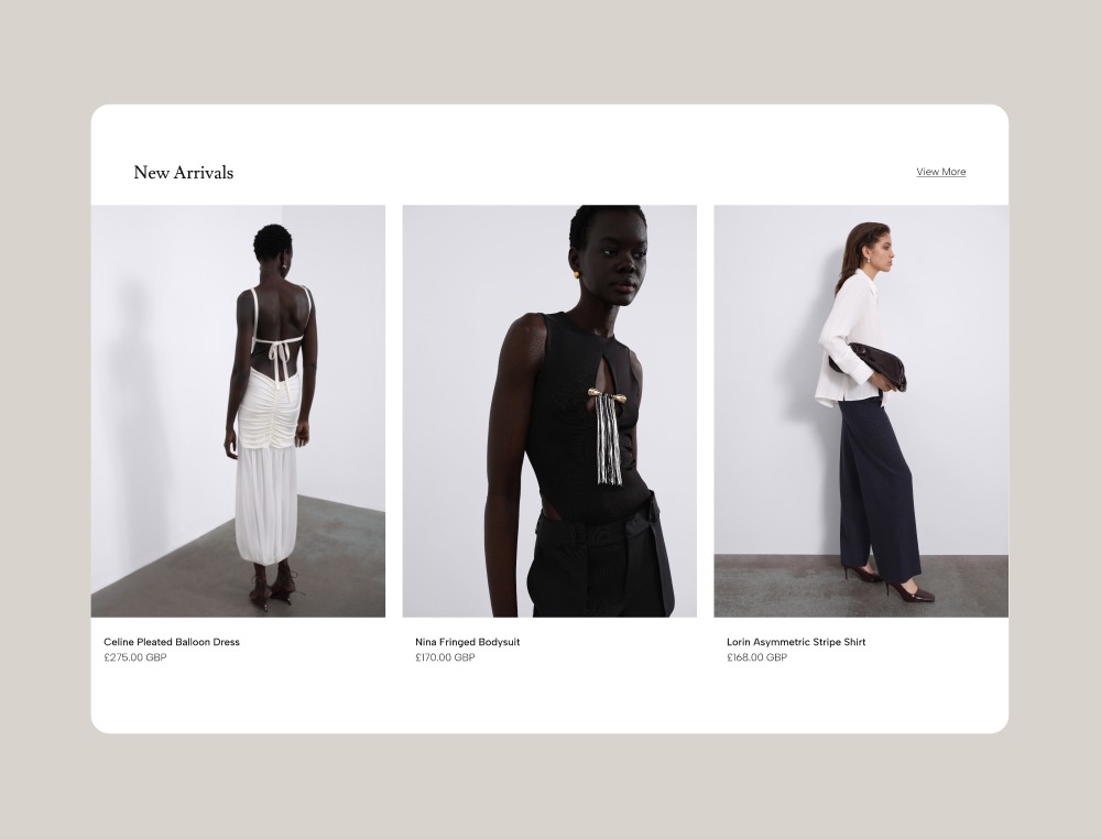
The store works as an ongoing lookbook.
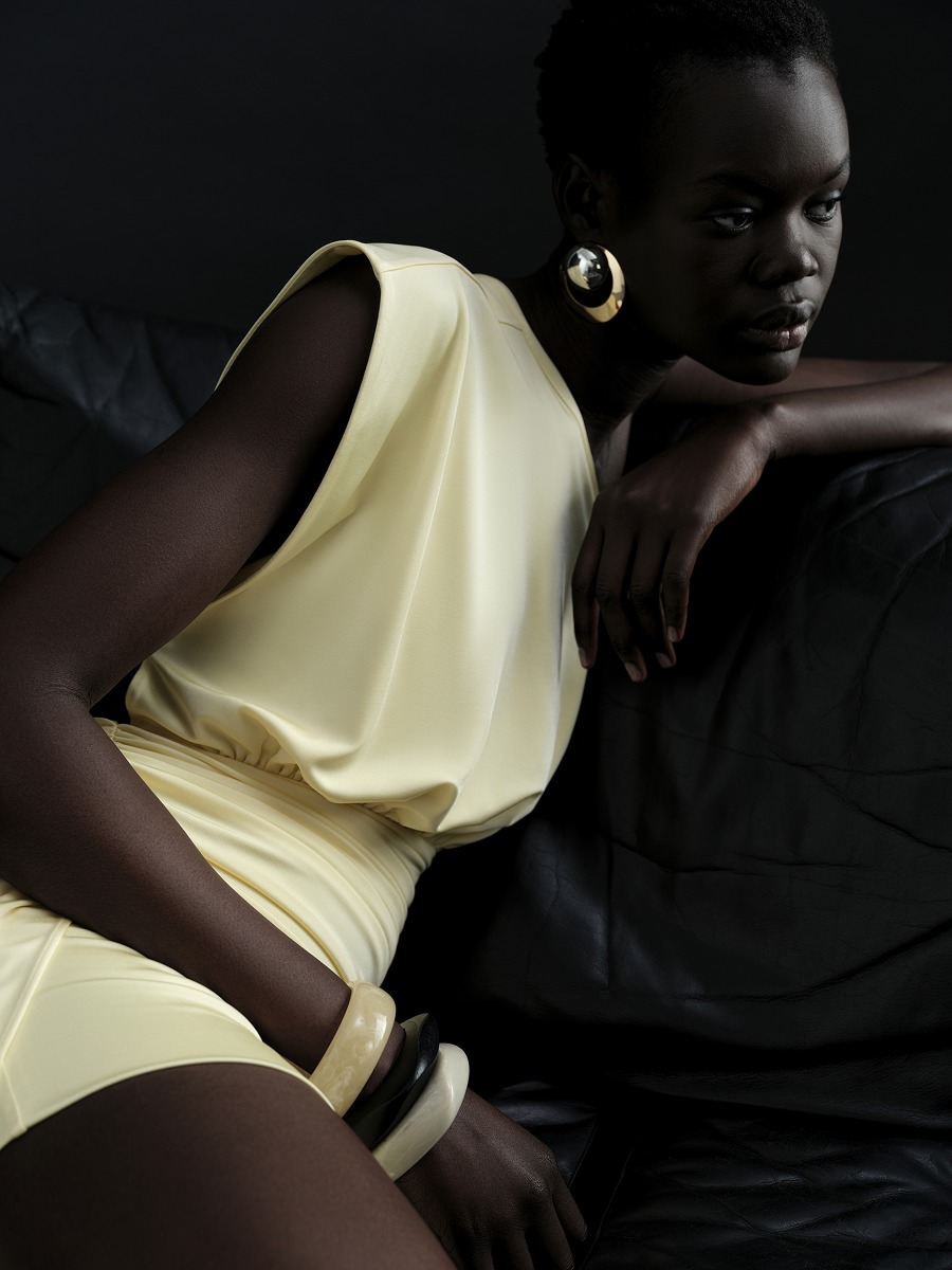
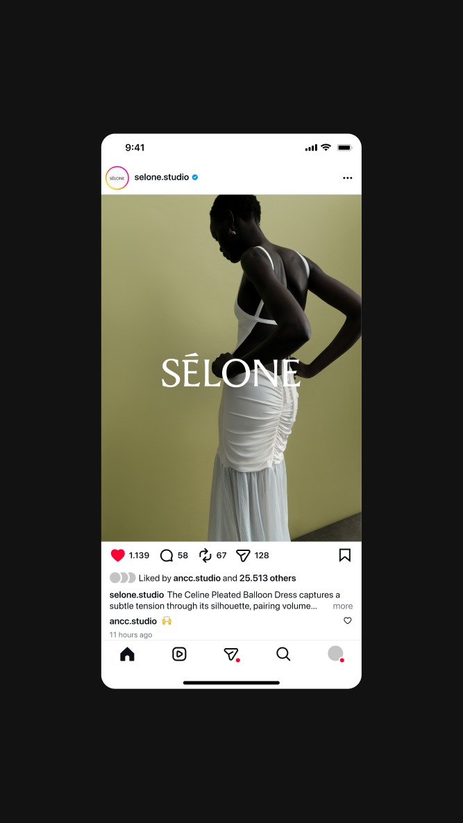
Each product page reads as a small editorial. The same images carry across the store, social and print.
Reels give each theme of the label a short film.
The Instagram grid holds campaign and lookbook images, and Stories follow the day.
Sélone is a womenswear label built around contrast: softness and structure, movement and stillness, familiarity and the unexpected. Our task was to translate that tension into a digital experience that felt as considered as the clothes themselves.

