No Grey Area

No Grey Area

Identity and website for a clothing label drawing on Indian dress.

Services
Branding & Identity
Typography
UX & Web Design
Art Direction
Year
2022
Identity

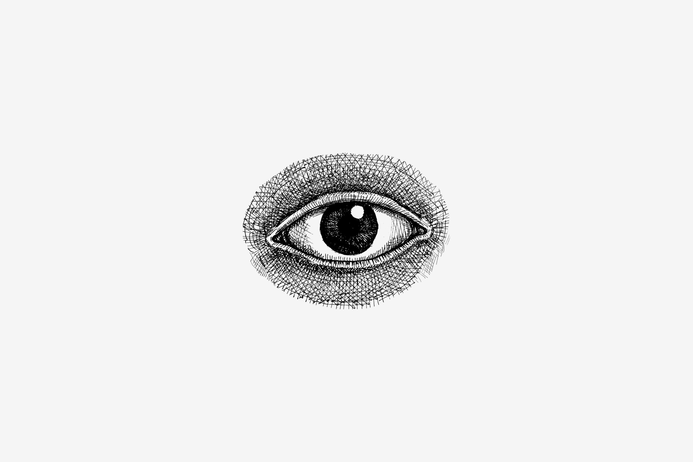
The eye works as a second mark.

The name is one line of light capitals. The eye, drawn in fine hatching, is used apart from it.
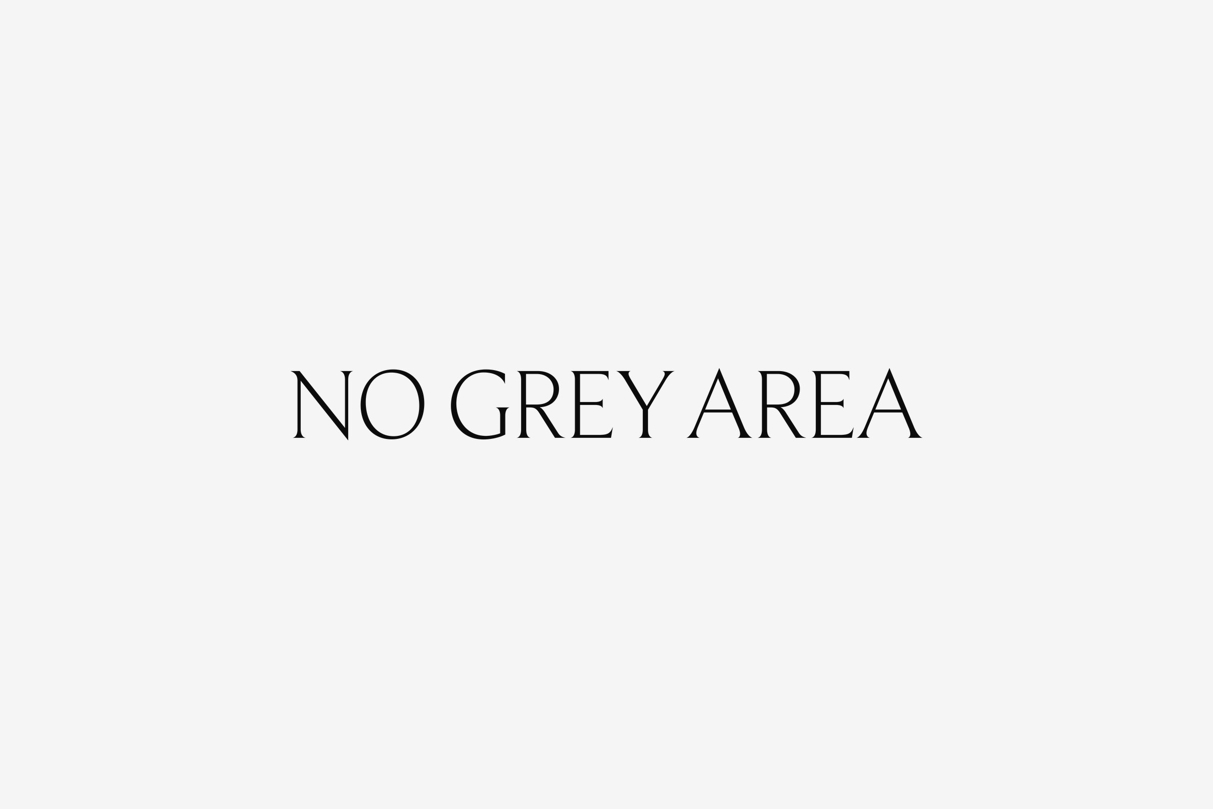
The No Grey Area wordmark in black capitals on grey
An eye drawn in fine black hatching on grey
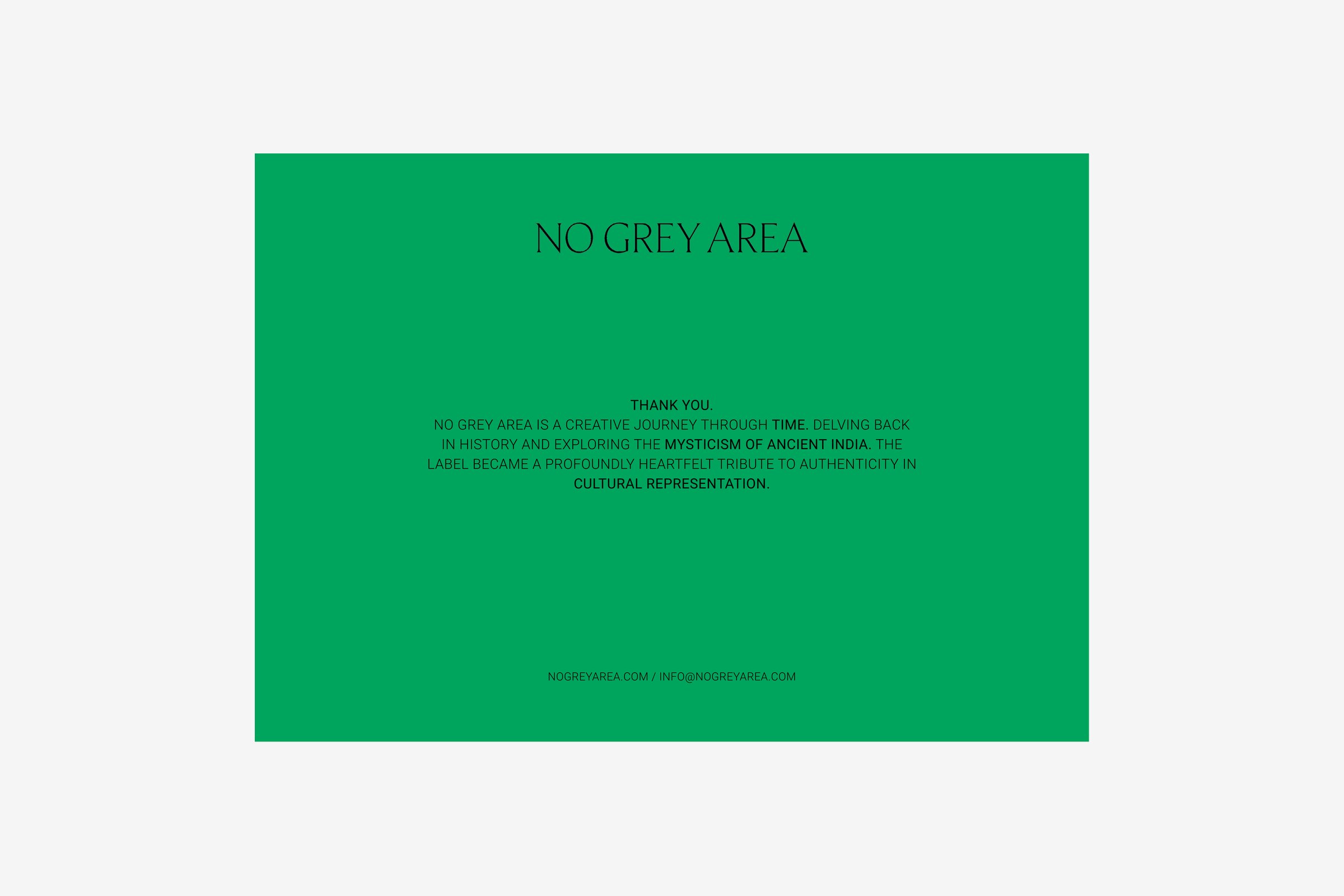
A green thank-you card with the wordmark at the top and the label's own account of itself beneath
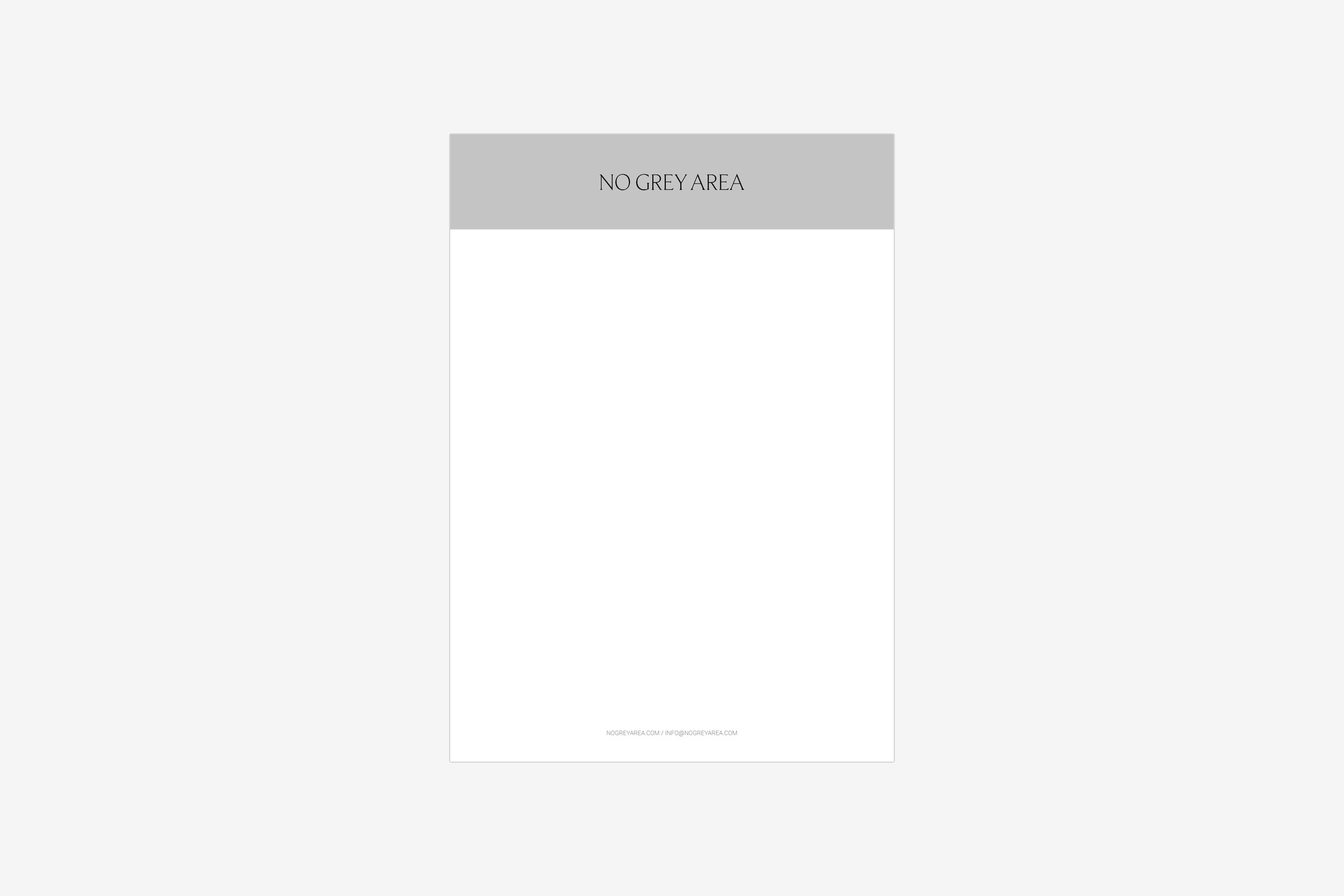
Letterhead with the wordmark in a grey band at the top
Tags

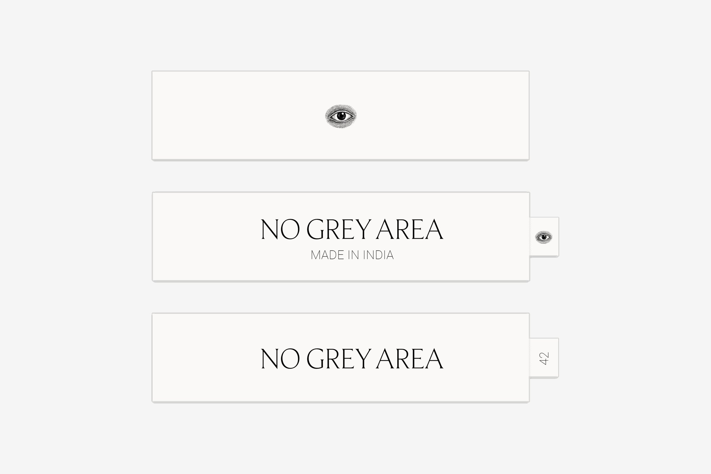
Made in India, under the name.

On the hang tag and on the woven label.
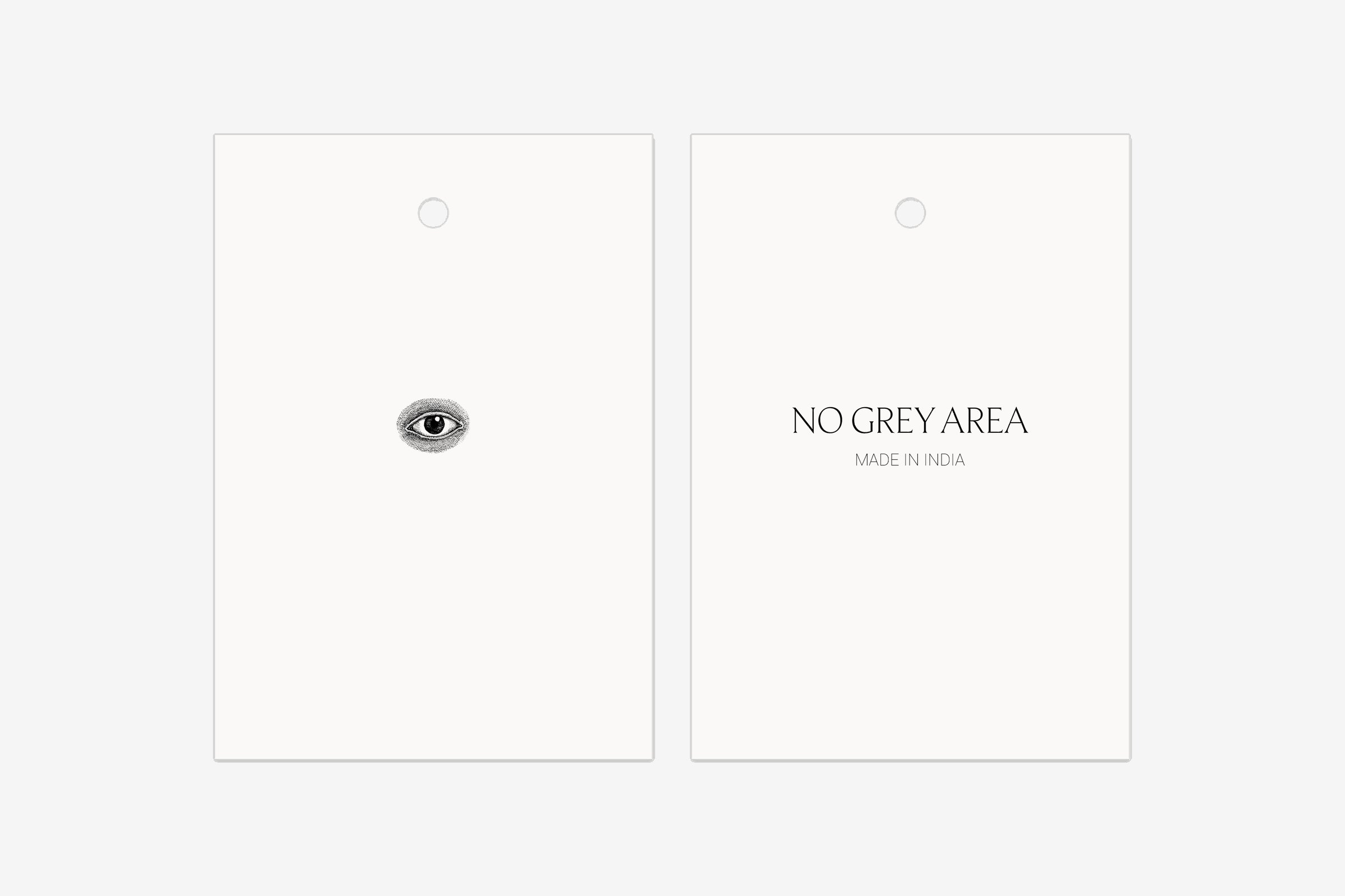
Two hang tags, one with the eye and one with the wordmark and Made in India
Three woven labels: one with the eye, two with the wordmark, one of them with an eye tab and one with a size tab
Website

Moon phases line the foot of the homepage.

The homepage opens on a full-height portrait from the collection, with the wordmark and three links.
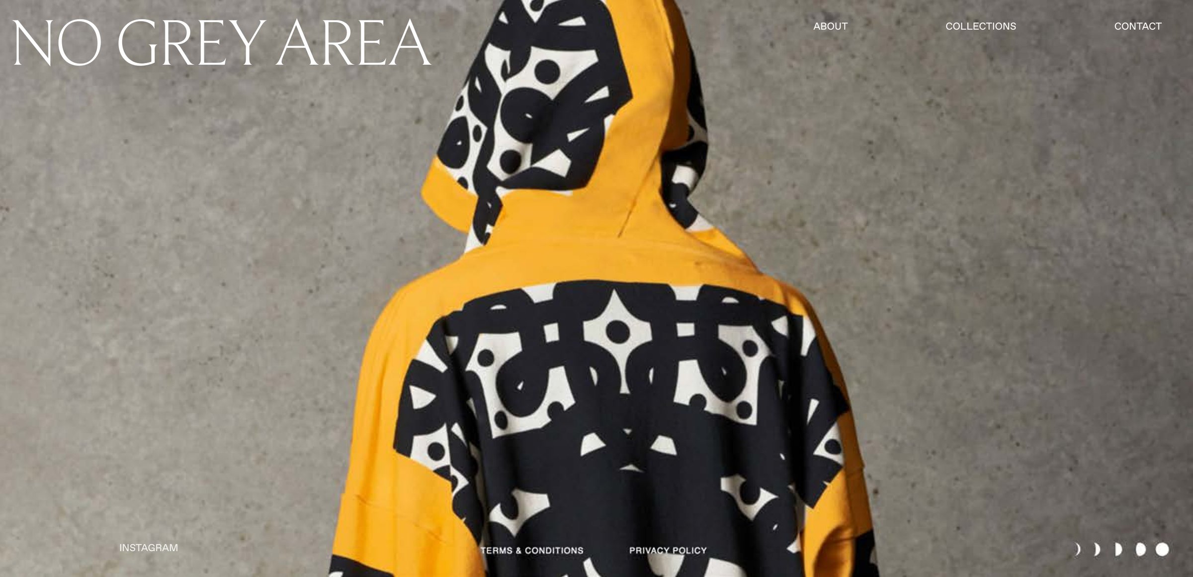
Homepage design: the wordmark top left, three links top right, a portrait of a yellow hooded top with a black and white print seen from behind, and five moon phases at the foot
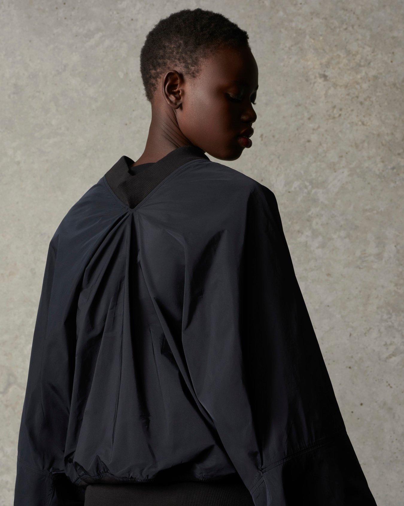
A model seen from behind in a black jacket with a gathered back and ribbed collar, head turned to the side, against a concrete wall
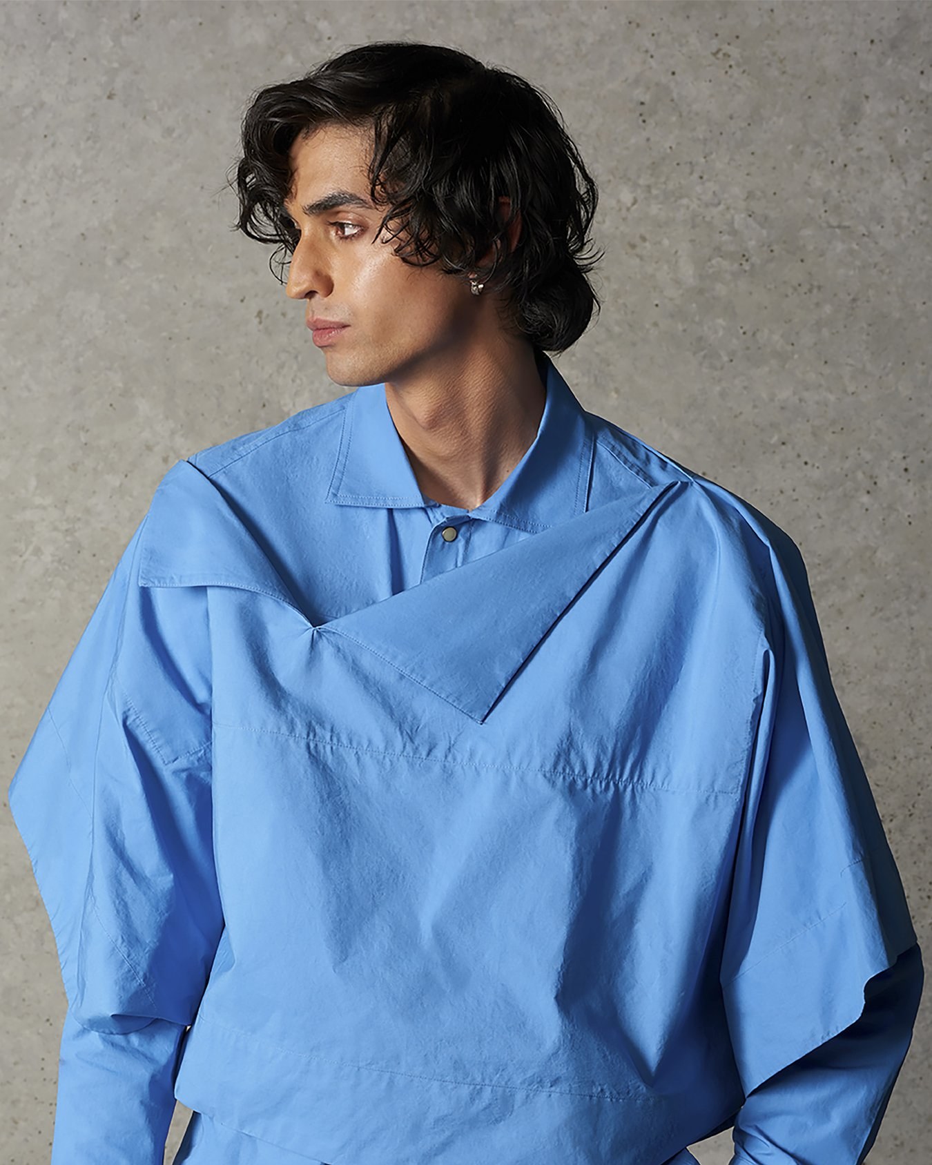
A model in a bright blue shirt with an angular layered cut, against a concrete wall
Credits
Branding & Identity
ANCC Studio
UX & Web Design
ANCC Studio
Stylist
Ben Schofield
Related projects