No Grey Area

No Grey Area

Identità e sito web per un marchio di moda che si ispira all’abito tradizionale indiano.

Servizi
Immagine di marca e identità
Tipografia
UX e web design
Direzione artistica
Anno
2022
Identità

L’occhio funziona come un secondo segno.

Il nome è una riga di maiuscole leggere. L’occhio, disegnato a tratteggio fine, si usa separatamente.
The No Grey Area wordmark in black capitals on grey
An eye drawn in fine black hatching on grey
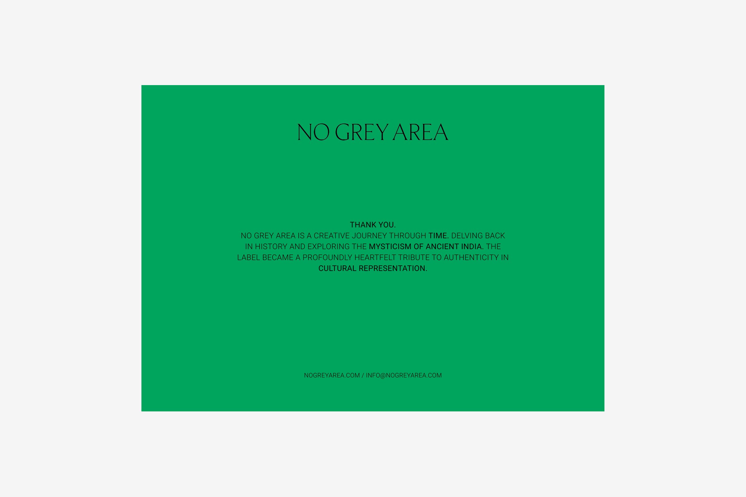
A green thank-you card with the wordmark at the top and the label's own account of itself beneath
Letterhead with the wordmark in a grey band at the top
Etichette

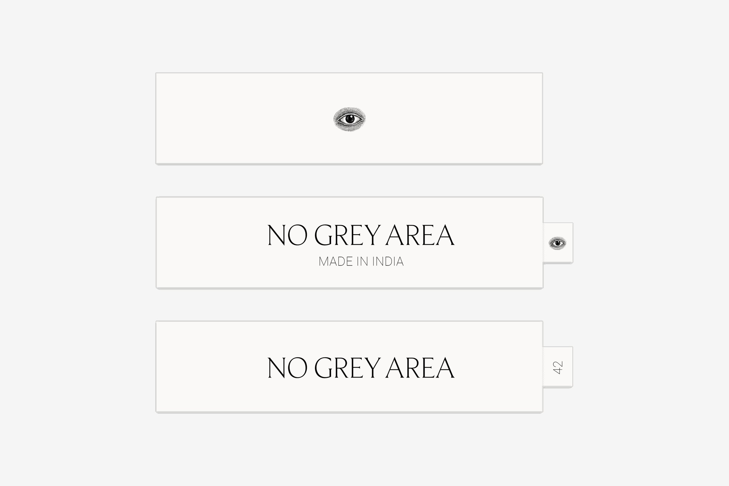
Made in India, sotto il nome.

Sul cartellino e sull’etichetta tessuta.
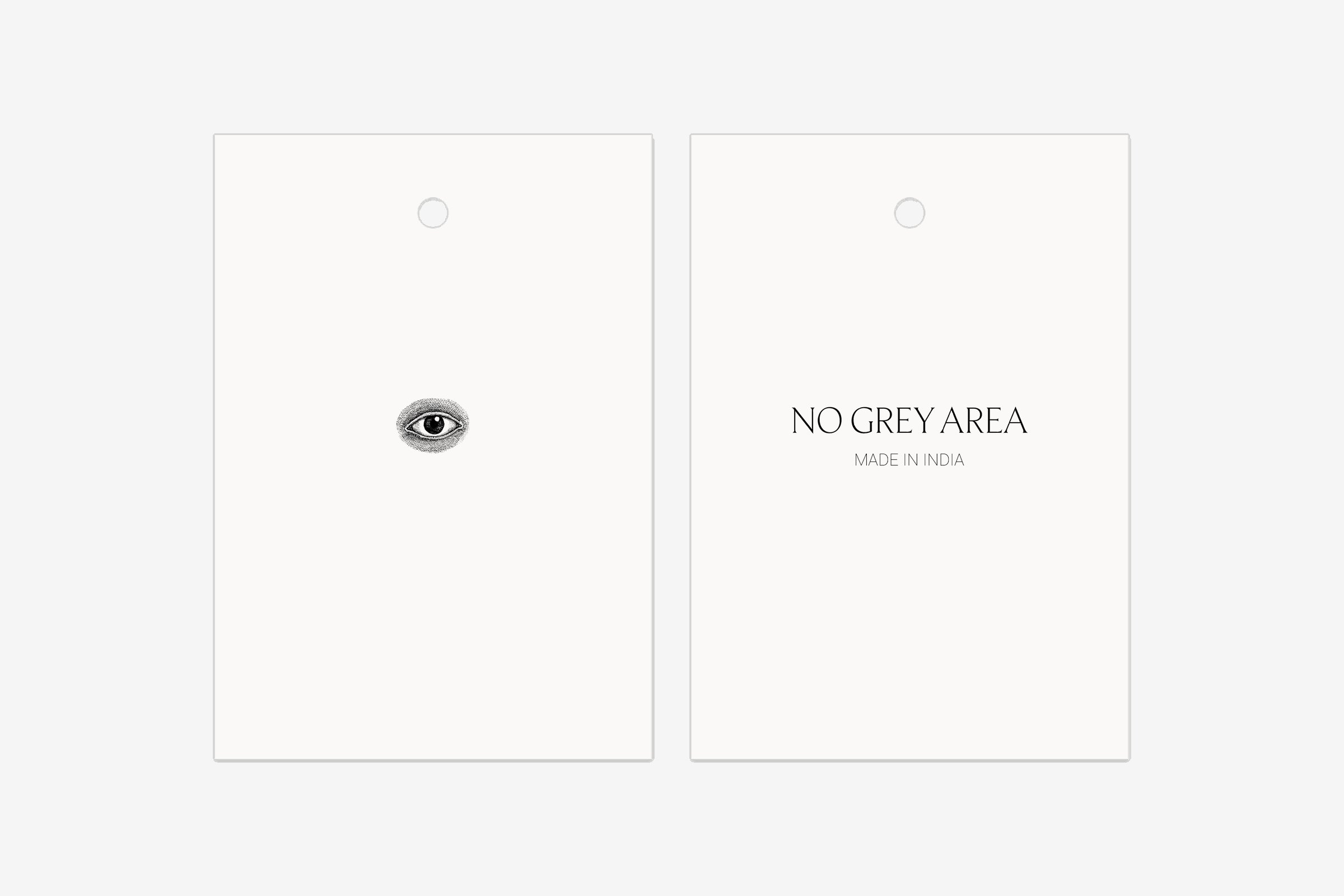
Two hang tags, one with the eye and one with the wordmark and Made in India
Three woven labels: one with the eye, two with the wordmark, one of them with an eye tab and one with a size tab
Sito web

Le fasi lunari corrono in fondo alla home.

La homepage si apre su un ritratto a tutta altezza dalla collezione, con il logotipo e tre link.
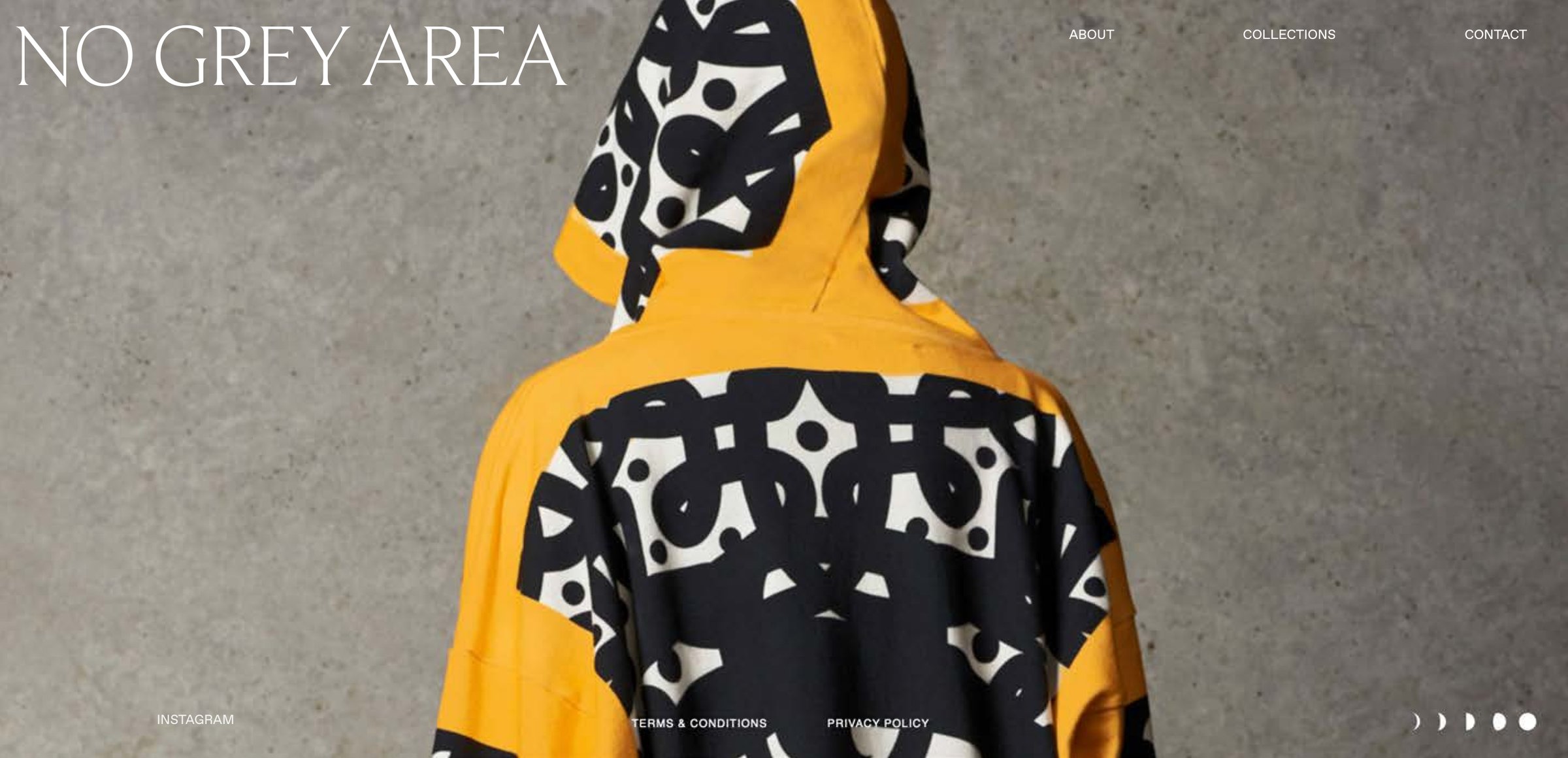
Homepage design: the wordmark top left, three links top right, a portrait of a yellow hooded top with a black and white print seen from behind, and five moon phases at the foot
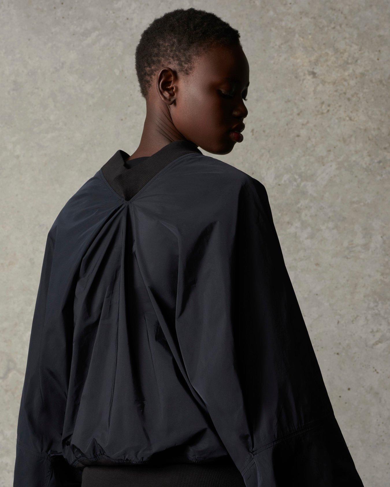
A model seen from behind in a black jacket with a gathered back and ribbed collar, head turned to the side, against a concrete wall
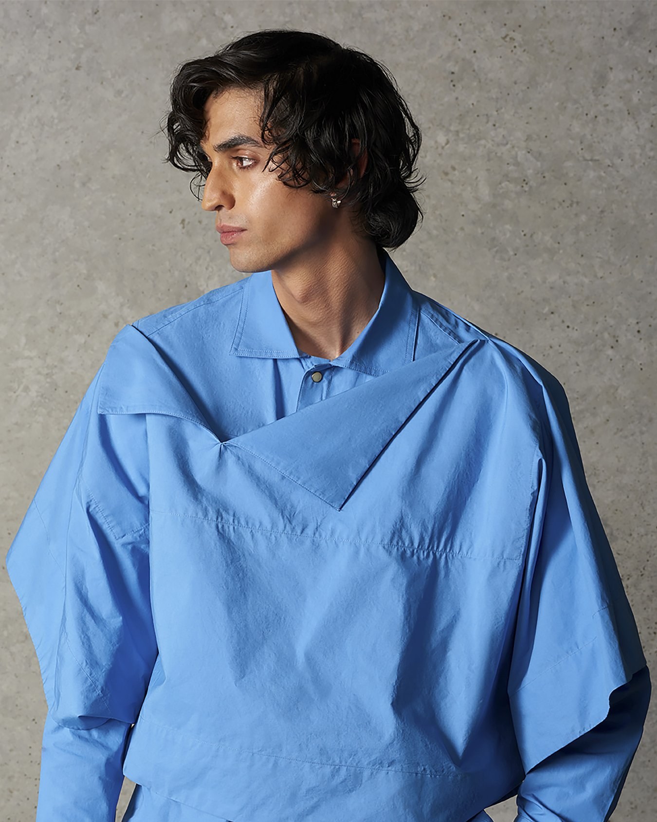
A model in a bright blue shirt with an angular layered cut, against a concrete wall
Crediti
Immagine di marca e identità
ANCC Studio
UX e web design
ANCC Studio
Stylist
Ben Schofield
Progetti correlati