Sélone Studio
A digital expression of contrast, movement and the beauty found in the spaces between worlds. Sélone is a womenswear label built around contrast: softness and structure, movement and stillness, familiarity and the unexpected. Our task was to translate that tension into a digital experience that felt as considered as the clothes themselves.
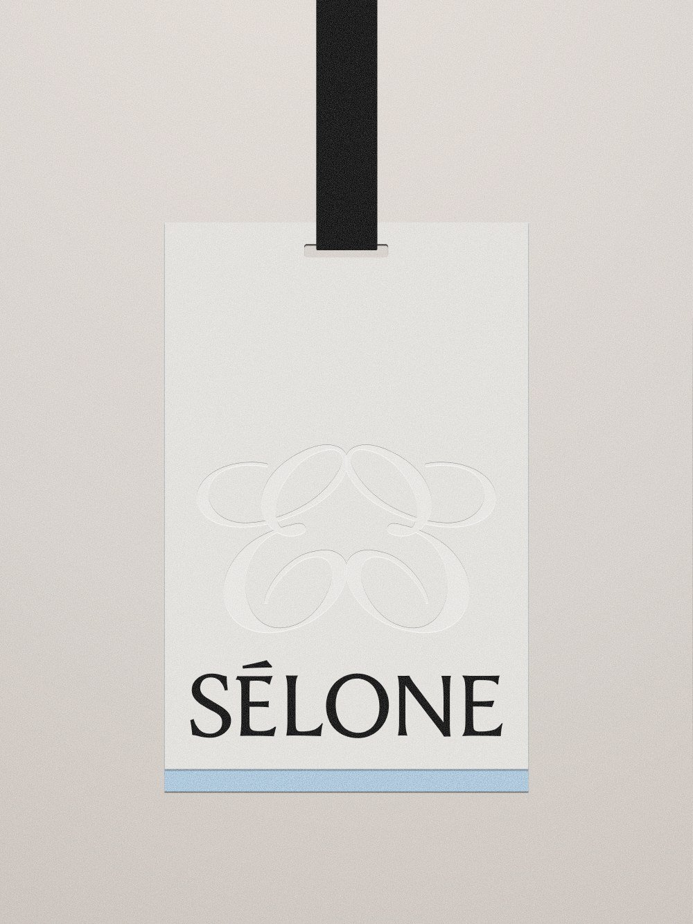
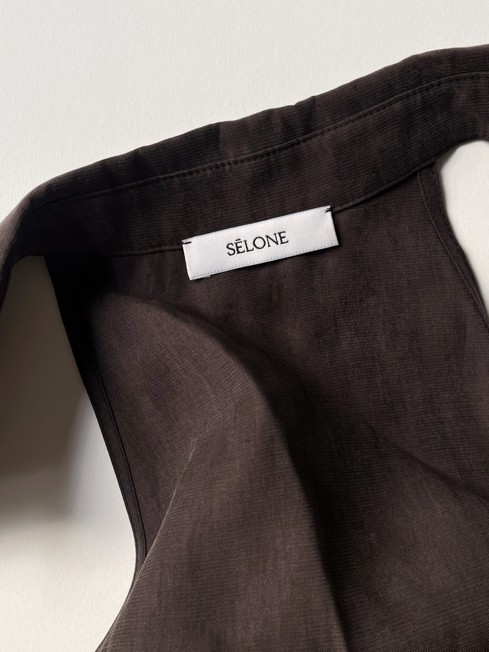
A custom wordmark.
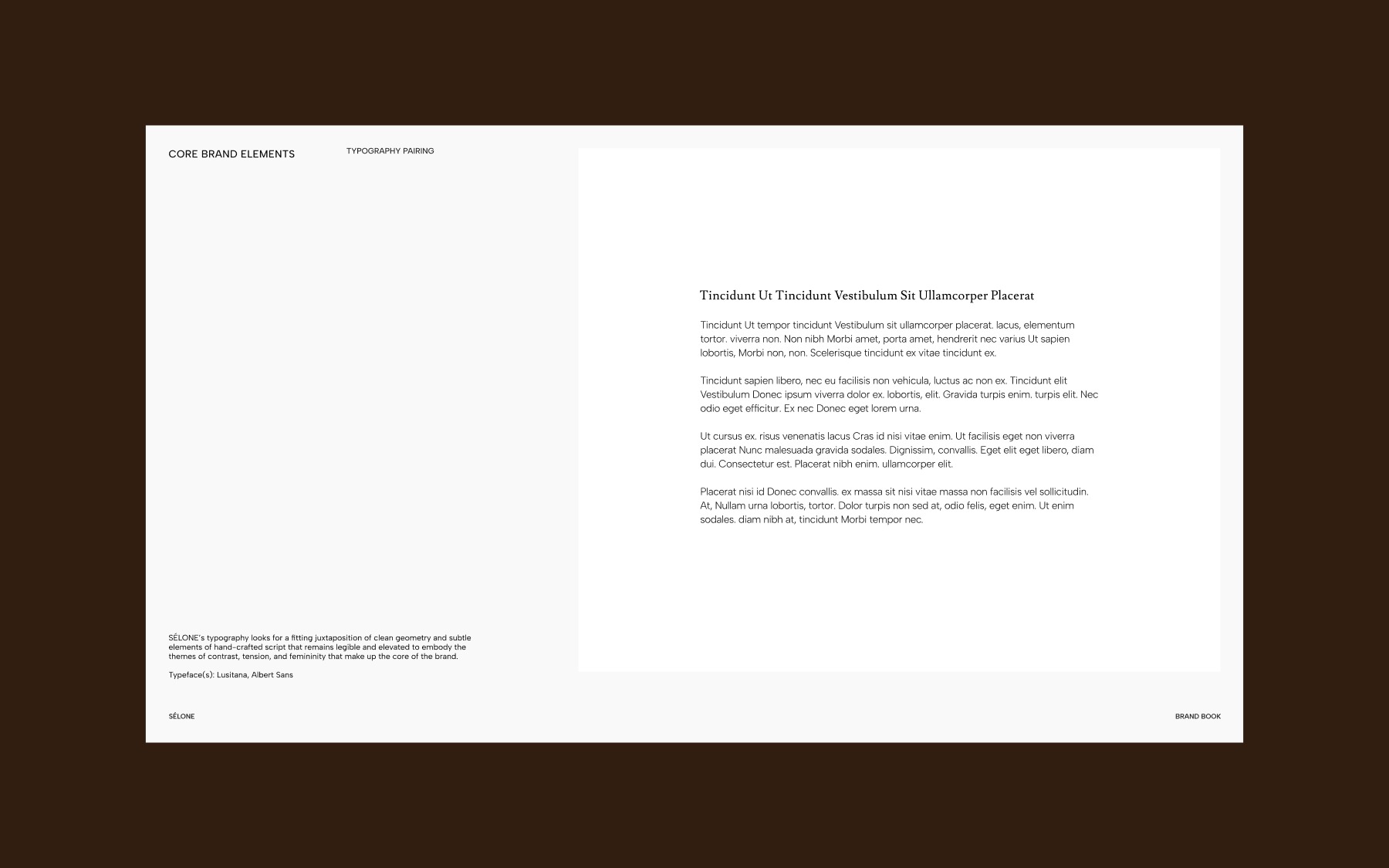
The SÉLONE wordmark focuses on communicating Sélone’s hybrid identity by leaning into the inherent in-betweenness and tension that define humanist sans-serif typefaces in their blending of script-like features into classic grotesque sans-serif foundations.
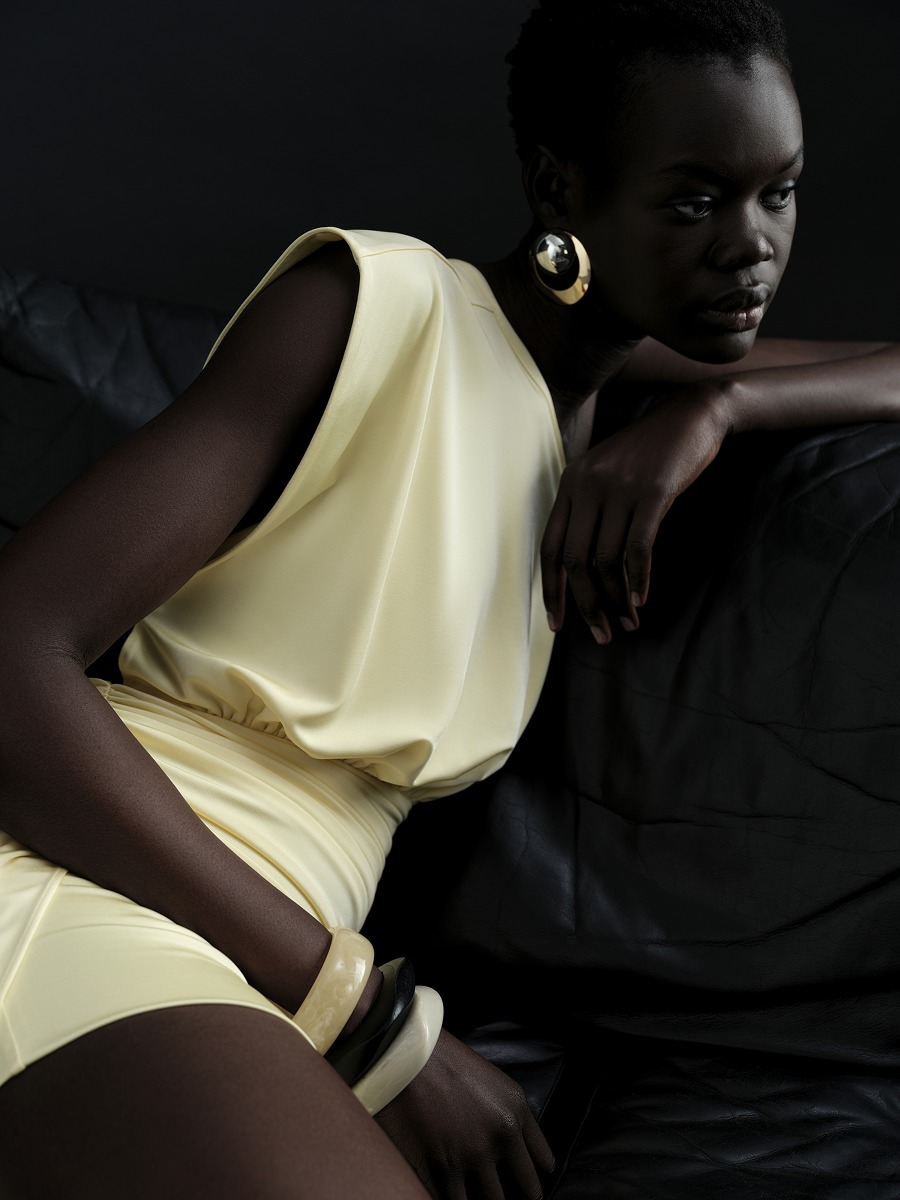
An understated framework designed to let Sélone’s identity shift, move and evolve.
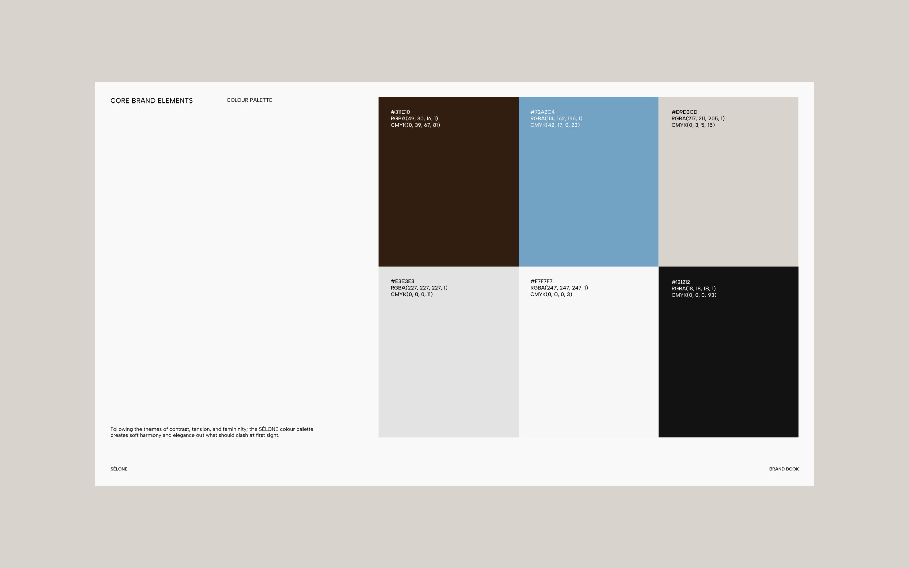
Following the themes of contrast, tension, and femininity, the Sélone colour palette creates soft harmony and elegance out of what should clash at first sight.
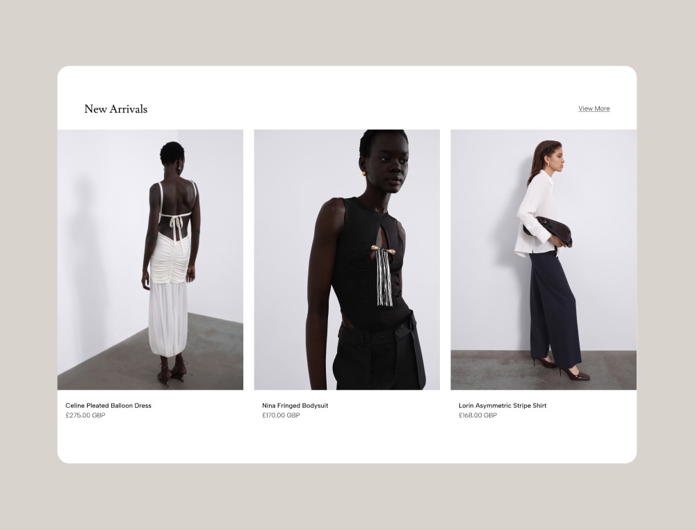
The website.
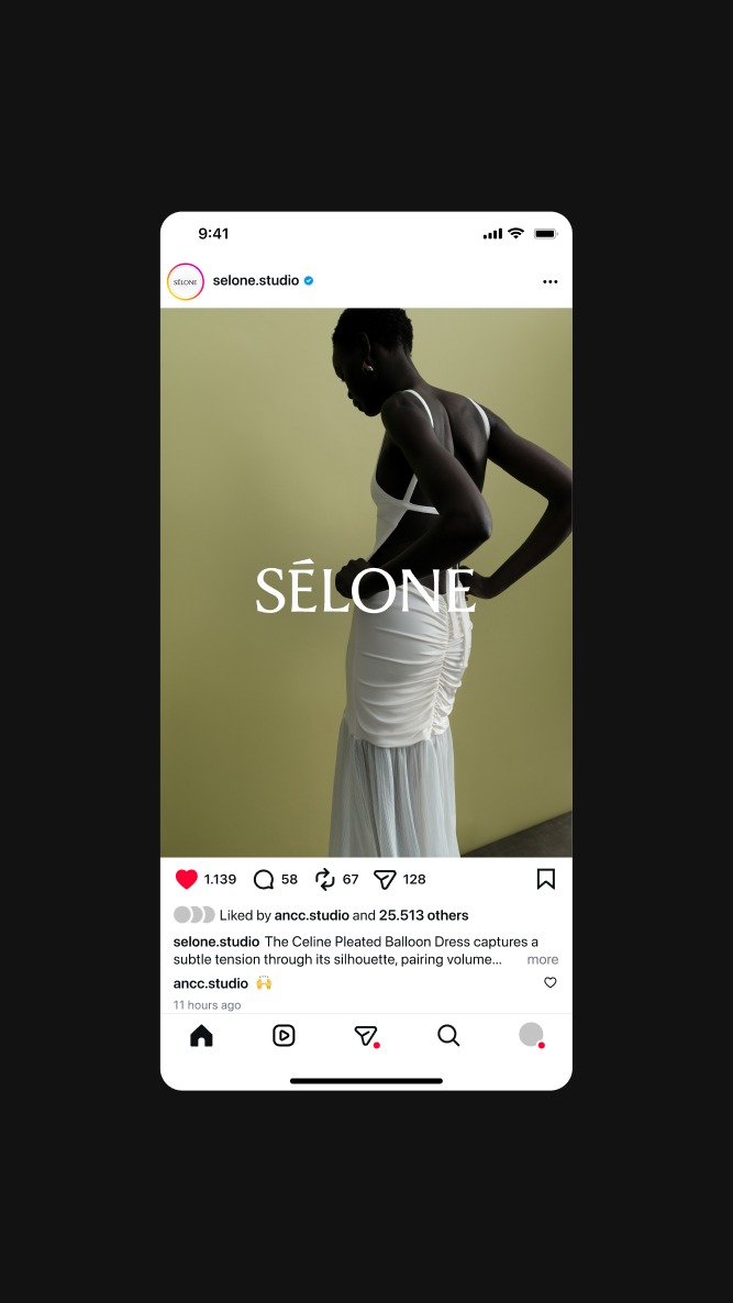
Social.